September 29th
new format for updates!
After about eight months of derailing my intention (in favor of printing and other projects),
I've finally taken the step of turning this
hand-edited & coded "update page" into a formal "blog". (Mostly thanks to
WordPress which writes all the code!)
This means: the posts are
organized by date, findable in an archive, and searchable (at some point soon). The page is smaller in size
and takes less time to load, hopefully. I'll be able to update it when away from my computer. The layout is
better (though not really done yet). You can subscribe to these updates via RSS and get them delivered
to you whenever I add something new (mom, I will show you how to set this up if you want). You can
leave a comment if you want to, ask questions, say hi. Overall, it's more flexible & hopefully easier.
I won't update here anymore, so click here! to get to the
new page. Also soon, when I have some more photo documentation and decent images to look at, a gallery will go on
the index page of the website, and the whole thing will get reorganized.... yeah, soon, soon.
* * * * * * * * * * * * * * * *
September 26th
Magic City Repairs, part II: Worcester!
First of all: subscribers — did you get your print yet? Everybody who subscribed before August should
have their print, with a couple of exceptions. I'm holding on to a couple for people who are traveling,
when you come back, it'll be here. Four people have yet to pick theirs up: if it's you, email me
or call me and come get them!
As far as I know so far, two people didn't update their address with me when they moved, so there
are those two prints somewhere in postal limbo. Two other prints (that I mailed later than the first
big batch) haven't arrived yet, the post office claims that they "fell off the conveyor belt"
somewhere and will get there eventually. Thanks, USPS. So to anybody who didn't get their print
yet, let me know if you haven't, and — patience — I'm sorry...
If you subscribed in September, you might not have gotten yours yet because I haven't done a
second big mailing/delivery... It's coming, I just have to plow through the last couple of days
of this project I'm working on now which is:
Magic City Repairs! part 2, in Worcester, MA.
This Thursday, Sept. 27th, in the afternoon, Andrew Oesch & I will be in Worcester hosting another city-building
day where you can come make some kind of building or structure and add it to what is shaping up into
a magic city atop a giant cardboard mountain with a cave you can go inside and some cardboard archways
and structures that can only get bigger & better in the next month. Lots of information is on the
project web site, the whole show is up till November 9th
so there is no excuse not to miss it okay? Given the scale of the space and of our installation, and
the nature of the context which is a relatively careful, proprietary, and non-messy university visual arts department,
this version of the Magic City project has come to incorporate both the dreams of 12-yr-old jean to
have an infinite number of cardboard bricks to build a building out of... and the dreams of 28-yr-old
jean to help create an equitable society in which anybody can build and shape things according to their
desires. Could I ask for more ??? (well, maybe.... now about that adventure playground....)
Thanks to help from Jake B and Jay R Z
this web site should soon become some kind of more formalized web log. It will be set up so things are
more organized, and so that you can sign up for updates whenever I post stuff via
RSS. There are many other things that are
happening "soon", so I'm not going to even talk about them here because that "soon" keeps getting larger and larger....
* * * * * * * * * * * * * * * *
August 27th
Monday...
The prints are done — as of last Thursday night/Friday morning.
I printed the seventh color on Wednesday night/Thurs morning. After I'd printed about
six copies, I realized that I had run into a classic transparent color problem, which I had
expected to happen at some point along this process... but hadn't looked for at the very end.
(background information: the previously promised transparent color mixing notes.)
It is especially hard to
predict how the transparent colors are going to act when printed: what they
look like is determined by the amount of pigment in the transparent base, and by how thickly it lies
over the other colors. You can test solid colors by wiping them with a brush or your finger on a
piece of paper, but with a transparent color you have to print it through the screen to see how dark
or light it will be, and how it will change the color behind it. The transparent base I use also
makes the printed colors a little bit iridescent, so they are darker or lighter when you look at them from different angles...
So, the 'classic problem' comes from the transparent color unpredictability combined with the hope of
the printmaker that the color she mixes, at a certain density, will turn out to be the correct value to
create a bunch of different effects in different places all over the print. In this case, the large
text needed to be dark enough to be legible, but light enough to reveal what was behind it;
the small handwriting text needed to be not too dark (so it
wouldn't show up as a blobby shape of its own) and not too light (so it could still be read); the small
drawings of people in the rooms needed to be dark enough to be seen clearly.... and the wall
in one of the upper bedrooms needed to be a light enough value to contrast with the wall of the
hallway, and push the room walls a little further into the distance.
As printed, when the large text and the small people in the rooms were legible enough, the walls of
the upper room were waaaaaay too dark. Since I was using the values
of different colors in the print to try and create the appearance of receding space, this kind of
value conflict —
which actually made the room walls almost the darkest thing in the composition — was
non-negotiable: it totally broke down any sense of space in the upper part of the print. After
a couple moments of frustrated contemplation (post-midnight), considering various possible solutions, I decided that
the best path would be to finish printing the transparent blue as planned, and then shoot another screen
with just the wall shapes on it, and use that to print a transparent light color over the dark areas.
So I did end up printing an eighth color after all, Thursday night into Friday morning. It left me
completely exhausted... and if I
hadn't written about it, you would probably never have noticed it.
However! the prints are finished.
I am working on a letter that will go out with the prints, that should be done tonight.
Prints to out-of-town subscribers will be
mailed out tomorrow (Tuesday) afternoon, and prints for Providence subscribers will be ready for
pickup after that — I will also do some delivery runs around town.
Then it's on to some more exciting stuff...!
* * * * * * * * * * * * * * * *
August 22nd, 7 am
almost ready
The transparency for the seventh and last color is ready.
In the 'morning' (2:30 pm, when I wake up...) I will shoot the screen... and if all goes well,
print it tomorrow night/today (Wednesday into Thursday).
Thursday: sort out, sign & number.
Friday: pack up some posters, head to Worcester to deliver the Worcester subscriptions.
Saturday & Sunday: back to Providence, address and prepare for mailing. Contact Providence
subscribers and deliver posters around town.
Monday: mail out posters.
... there you have it.
Reading:
The Shape of Content, by
Ben Shahn.
Essays about art and why it might be worthwhile to strive to create anything in the world.
I read this book when I was 17 or 18, and coming back to it now I found myself
thinking "Oh, I've read this one before, I don't need to read it again..." Then a couple of sentences
into the essay: "Hey, wait a second — I don't remember this part!" It's really thoughtful,
down-to-earth, and unpretentious, focused on art's connection to and meaning within life.
Reading it now, it is obvious that
this book was about 50% of the reason why I ended up dropping out of the the University of
Chicago when I was 19. (the other half? attention deficit disorder.)
* * * * * * * * * * * * * * * *
August 17th
revisions... and a schedule
I decided a couple of days ago that there will be no eighth color. This doesn't save me a ton
of time, since all the elements that were going to be part of the eighth color are still going to
be in the poster, so I still have to draw them, but it probably cuts another four or five days off the time, for
screen coating, preparing the transparency, color finagling, aligning, and printing.
I am going to miss that orange color, but
I think I will get a lot of opportunity to play with orange, pink, and other colors in that realm
in the next poster!
So yes, subscribers, there will be a print coming your way sometime soon! Friday, August 24th
is the tentative but actually realistic date by which I hope to have all the posters printed, signed,
and numbered. Packing them in tubes & addressing them will take a little bit longer.
I will be in contact with everybody to let them know that their prints are in the mail, or to figure out
drop-off or pick-up times.
here is a detail of one of the ink drawings that is going to be included in the last color:
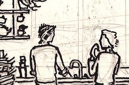
This is a scan of the ink-on-mylar layer taped over the paper drawing: the black lines will
be the only part that will print.
Here is a preview of a couple of these small interior
elevations. They will be printed in transparent blue ink to give detail and interior life to the nine
small window "examples" that are spread across the print.
[edit, August 21st:] I forgot to mention that, although the interior elevation drawings were
planned as part
of this print since back in February, their continued existence and development owes a debt to the work
of British artist
Chad McCail, who I found out about sometime in July, and
who is also working on revolutionary and radical
projects, partly using techniques lifted from architectural illustration. [end of edit]
The past couple of days have been rough: my friend's grandfather has been very sick; Alex Svoboda,
a girl
I know here in Providence, is in the hospital with a serious, serious leg injury after an encounter
with police at a labor demonstration; our housing situation is still a little bit up in the air; and
various un-tied-up loose ends have been weighing on my mind and making it hard for me to concentrate
and focus. Writing the distracting worries down helps, checking off things I get done helps,
eating dinner helps, organizing things in the kitchen helps,
bike riding helps. This evening I biked with Scøtt to
New Urban Arts to print out the final
copy of the large letters made out of the window frames, plus some
transparencies for the Work/Death patches Scøtt will
take on tour. It was raining slightly as I biked back towards my house alone, it was just before
the 1 am hour when all the bars close, so nobody was on the streets, it was quiet.
Inexplicably, I found that a lot of the weight was lifted from my shoulders — no giant revelation, just
an understanding of things continuing and progressing, even in the middle of extreme stress, terror,
and inhumanity. So, these images of people at harmony in their houses
are posted here, as this whole print project is being created, with hopes of continuity & progress...
* * * *
Pictures of Alex's injury are here: I didn't put them
on this page because they are extremely gruesome and saddening, I didn't want to force anybody to look
at them.
How to help Alex out (hospital bills, spreading the word, writing letters, activism & organizing:
— support
blog with updates, contact info, where to send donations, etc.
— come to the August 26th
march against police brutality in
North Providence.
* * * * * * * * * * * * * * * *
August 7th
sixth color!
The sixth color, the first transparent color, was printed yesterday/last night, with an
afternoon session for alignment & color mixing, then a late night run 11 pm - 4:30 am,
with lots of time afterwards for cleanup, kitchen work (putting away finished kimchee!).
Made it to sleep by 7:30 am.
Images soon, plus some more discussion of transparent color printing. This color was a
yellowish-white, which provided a bunch of detail and definition for the windows in the two
large perspectives, and created the rooms that surround the small interior-elevation windows,
among other things.
For the impatient (which includes me!), there are just two colors left:
— a transparent blue, to
darken some stuff up, print the large letters created in the past couple of days, and
create people & furniture to show life, activity, and use in some of the "empty rooms".
— a bright orange (related to the golden/ochre yellows), which will
create small text, notes, description, as well as other necessary information/detail...
* * * * * * * * * * * * * * * *
August 3rd
generative patterns
The question of how text should be incorporated into the first poster worked itself out in
a couple of crucial conversations with
B and
Andrew. As I cut out the
detailed window molding lines for the 6th color....
... I had gotten excited about their graphic
potential and had wanted (partly inspired by some of
Jay's working
processes...) to copy and enlarge them,
cut them up, and play with making patterns and shapes out of them...
"save it for the next project, don't get distracted" was my initial response to that desire.
Later I found myself saying to B: "the large text needs to be made out of some kind of
stencilly letters, a little bit disintegrated so you don't read them right away, but then looking
closer they resolve into text... letters made out of a bunch of separate lines..." and realized
that I had the next step sitting in front of me on the desk.
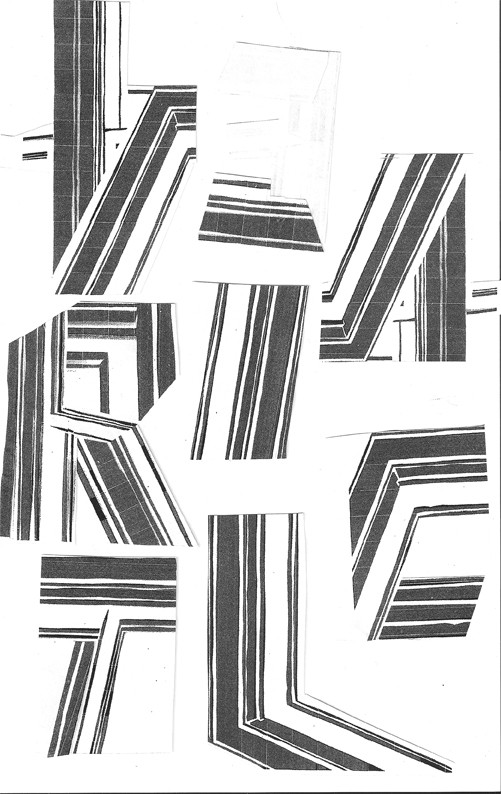
a beginning...
* * * * * * * * * * * * * * * *
July 29th
details of the 4th & 5th colors
can be found by clicking on this image:
...and my
letter to the editor, concerning green architecture & tax breaks
(in reference to
this article) was published in the Providence Phoenix. Thanks, Phoenix!
* * * * * * * * * * * * * * * *
July 27th
fifth screen!
Printed on Wednesday, July 25th. I had already mixed the colors and shot the screen
last week. Came back from
a quiet couple of days in the woods late Tuesday night. Set up the screen and aligned in the
afternoon, then did some mostly frustrating and unsuccessful test prints — ink drying in the
screen again, studio too hot. Then I went out to do errands and see the
shadow puppet show that Andrew Oesch has been working on. Came back & started printing
by 11pm, with better success this time, due to the cooler night & lots of retarder base. This is the
last rainbow roll screen, and the last "solid color" screen — the next three colors
are going to be transparent overlays, outlines, small text, etc. By 7am I finished, cleaned up, & went to
sleep.
On Thursday I woke up early (11ish — that's four hours, people)
for a multi-hour hanging-out-and-talking-about-screenprinting session with Ken Linehan of Providence
& Matt Zaccharino of Worcester. We coated and exposed a screen for Ken, then troubleshot problems
Matt was having printing a poster (which looks awesome despite the fact that I only saw the misprints
he brought along to demonstrate the troubles).
Some of the vast knowledge that was shared during this conversation:
— If you just want to print simple designs on t-shirts or whatever, you can go to the fabric store,
go into the wedding dress section, and buy some of the cheapest wedding veil material, which will
serve as a perfectly adequate and extremely inexpensive screen fabric.
— There are barrels & barrels of
Plastisol ink
in a basement in Worcester, MA, waiting to be used for
people who want to make t-shirts or otherwise print on fabric. I try and stay away from this stuff (requires solvents for
cleanup, super messy, it needs to be heat-set at high heat just to stop it from being sticky...) but
hey, it's there if anybody needs it, get in touch if you're interested.
The past days have also found me spending time with
Jay Zehngebot and
Gaby Garza. Jay's a screenprinter, among other
things, and Gaby is a textile designer, among other things. Last night I got to see Gaby's knitted fabrics which
are amazingly beautiful & complex patterns. Jay's screenprinting work and
working process
is super inspiring to me, makes me want to draw more, print more, and do more in general!
... so with that thought, I'm going back upstairs to print. Today: finishing the CD covers (three-color print)
for
guitar-player/crooner Diego Perez. He and former
Amherst Zonian John McCauley have returned from tour
and are playing at Okie St. on Smith Hill this Tuesday night, July 31st, 9 pm. Go there, see the
show, say hi & welcome back to Diego and John, & get a copy of the album: if not for the music, then just
because the covers were more than seven months in the making.
* * * * * * * * * * * * * * * *
July 18th
the fourth color...
...was printed monday the 16th/tuesday the 17th, from 9pm to 7am, with a one hour break
10pm-11pm for dinner (and for meeting with my housemates to discuss what we might do if our
landlord raises our rent drastically in September when our lease ends, since property taxes in
Providence have just gone up a huge amount). It's a rainbow roll, gradient colors,
orange-brown to yellow. No pictures yet because I'm still hard at
work. Got to love the all-night, 9+ hour print runs.
Once again, a vague and perhaps un-keepable promise of the fifth color printing tomorrow...
if all goes well.
If anybody has some space in their work studio that might be sharable or for-rent, or a
cheap room in their non-smoking, cat-loving house opening up in September, let me know.
Hopefully moving won't be what happens in a month and a half, but I am apprehensive.
And if anybody wants to sign the Olneyville Neighborhood Association's Tax Strike pledge,
taking a stand against the recent absurd increase in Providence property valuations, you can
contact ONA
at 401 - four five three - six eight one one.
Recent wholeheartedly recommended reading:
Advertising the American Dream: Making Way For Modernity, 1920-1940 by Roland Marchand
How early advertising shaped American culture, mass media, societal
expectations, our lives and roles, and even the products themselves. This book has been messing
with my head, making me yell incoherently at magazine pages and rip them up,
and I can't stop reading it.
The Control of Nature by John McPhee
People trying to make the earth do something different than it was
going to do, and what happens afterwards. This is a classic. It's super hilarious, makes fun of
a lot of things, but is deadly serious.
Realizing the Impossible: Art Against Authority edited by Erik Ruin & Josh MacPhee
especially the essay: "The Twilight of Vanguardism" by
David Graeber.
It talks about the current rise of consensus-based decision making structures, how those present an alternative
to the cycle of artistic & political "vanguards" (ie. "our political (or artistic) movement is
the newest & rightest thing out there, and yours is completely wrong!"). It also presents ideas
about what roles artists play or could play in society and in revolutionary coalitions...
pretty darn solid.
* * * * * * * * * * * * * * * *
July 12th
third color!
Cooler weather, plus retarder base, plus clean newsprint sheets, plus a decent amount of sleep
= a good-looking and
relatively easy-printing third color — white with a tiny bit of blue in it.
There are some details here, though low-quality because of scanner limitations. Fourth color should
print tomorrow if all goes well.
* * * * * * * * * * * * * * * *
July 10th
nope
Well, I shot the screen for the third color yesterday and then found a couple of problems with the transparency,
one old and forgotten-about, and one a recent oversight. Additionally, part of the third color is made of
images taken from photos (views out of windows), and the transparencies for those were a little
over-exposed, not dark enough, with the exposure time I had used...
So... I took some time to correct the transparency, then shot another screen, with somewhat
more success, then went to bed around 4 am.
This "morning" I had a lunch conversation appointment at 12, so I got out of bed by 11:20 & biked
across town in the sun. Later on, I biked back in the sun, ate some food, got bummed out looking at a book
about advertising in the 20s & 30s, reading the part about advertising agencies congratulating each other for
"the invention of the danger of Body Odor". Thanks, guys, for burdening us with an intangible,
unappeaseable
insecurity, that still is with us 80 years later, just so your bosses could make a few more bucks. Good work.
In the third-floor studio it was really hot, and I figured by the time I had mixed the color,
taped up the screen, straightened up the studio, and otherwise gotten ready to print, it would have
cooled off somewhat. No real
luck — even by 8 pm when I put ink on the screen it was still pretty toasty, and I spent about
three hours struggling with getting an even coat of ink across the 18" width of the squeegee,
not letting the smallest detail lines drop out of the print because of uneven pressure,
and not letting the ink dry in the screen. This is the highest mesh count screen
that I've used: necessary
for the amount of detail I want to get, but it holds on to the ink, and requires a lot of pressure to
push it through completely, meaning that it tends to seize up in the screen pretty quickly, especially in
weather like this. The alignment of the third color is also kind of a tricky compromise, meaning that
it was taking me a couple of minutes between pulling each print: more time for ink to dry.
By 11:30 pm, I'd printed a bunch of test sheets and only five or six prints, none of which were satisfactory.
It had become apparent that
I wasn't going to get a good print out of the screen, with the ink
mixed as it was, in the heat, so encouraged by
Chris Monti's advice about the "rejuvenating power
of sleep" I decided to cash it in. I washed out the screen still in the hinges — an attempt
to not lose the time I had taken to tape it up & align it — cleaned up everything else, and
now I'm writing this pretty much totally exhausted & discouraged, after having been awake
for only 13 hours.
Tomorrow I'm up early, off to the store to get some retarder base (slows drying), some big containers for
mixing large amounts of ink, and a giant pad
of newsprint (part of the issue may be that the paper I have taped to the table under the print is not
totally smooth & resilient,
also since I'm doing lots of test prints and need to do them fast, ripping newsprint off the roll I
already have is taking me too long). I hear it's going to be cloudy tomorrow, so that gives me hope that
the ink won't be as quick to dry...
I'm not sure why every aspect of this project (from the scale, the complexity and the level of detail,
to really basic stuff like the exposure times) is posing such a challenge to me. I'm crossing my fingers
that by the next
print, a lot of these issues will be more or less solved and it will go a little bit smoother.
For now though, I'm not going to Maine, I'm not doing my laundry, I'm not going swimming, I'm not working on projects
anywhere else: I'm on the third floor of my house, under the roof under the sun, printing giant posters
for you.
[UPDATE (July 27th): fascinatingly (?), at almost the exact same time as I was struggling with my printing in Providence,
Jacob B. was struggling with his
printing in Worcester. We are not alone in these things.]
* * * * * * * * * * * * * * * *
July 8th
finally some images
I've been busy in the physical world and not in the world of the internet — that's a
good thing. These pictures of the first print in progress
were taken
on June 20th. The image quality is crummy, but they are adequate to show
the first two colors printed, and
the rubyliths as they were 2.5 weeks ago (they have changed since then!), with the pencil
drawing underneath. The photos don't show the entire print, just a couple of details, so it's not
a total spoiler. However, if you
want it to be a complete surprise, don't click on the link.
The third screen, a white-blue color, gets printed tomorrow!
* * * * * * * * * * * * * * * *
June 9th
not just dreaming?
The various city-building projects that I am involved in —
Magic City Repairs (at Stairwell and at the Dirt Palace) and New Your City — were written up
here
in the Providence Phoenix by Greg Cook (who draws comics
and writes about art in New England).
The conversation that Andrew O. and I had with him, as well as the review (which is positive but
leaves us with a very specific challenge!), have been making me think hard and get excited
about the future.
I need to go back to cutting up rubylith and not write more right now... but more plans and discussion
will show up here as I figure them out.
* * * * * * * * * * * * * * * *
June 5th
a couple more things are now finished.

Monday morning, June 4th, early early, I finished printing the final color on the final card
for my friends' wedding invitation. Above is a detail of the image on the invitation card —
I'll put up the full images later (when there's no risk of spoiling it for the invitees).
The invitation consists of an outer envelope, a main card, and a response card and response envelope.
They all have two colors, except for the main card which has three. They look great, despite my frustrations
with trying to print on a low-mesh-count screen,
and the bride- and groom-to-be are psyched. Yes, it was a totally over-ambitious project,
and kind of an absurd amount of work for such a small object. and No, I will not make your
wedding invitation, unless you are
one of my brothers or someone who I love extremely dearly, and even then not unless your wedding
is in 2010 or later. (see, the No More New Projects plan is pretty serious...)
So: the Magic City art show at Stairwell Gallery is up and open, people are coming in to build buildings out of Andrew Oesch's
and my screenprints on Thursdays through Sundays, 11am-4pm. The wedding invitation is done.
New Your City
is re-installed in the Public Safety Building, and there's going to be a celebration party with the
mayor and the police chief on Monday, June 11th, from 5-7 pm.
With many of my "smaller" side-projects finally out of the way, I am excited to work without
interruption on the print series project. If you're a subscriber and the extreme lateness
is making you crazy, let me know.
So obviously I have a huge amount of trouble with time, organization, and prioritization.
I am trying to find what is valuable about the way my brain works — with its loops and
jumps, shifts of focus,
unexpected connections, etc — and not condemn it, or myself, for being inefficient, disorganized, or
lazy. The print series project is (in one sense)
part of a long-term strategy to develop ways of working that push me to work hard,
while challenging and
sustaining me creatively and intellectually, and increasing my understanding and analytical capacity.
The Magic City
project, collaborating with Andrew Oesch on the
Dirt Palace window installation and on the large drawing that is in progress at Stairwell Gallery,
is a part of a much looser long-term goal, creating spaces where I can work without worrying about making
something crappy, where I can stop myself from automatically 'correcting'
perspective or proportions, and where I can take a chance to play with drawing and building
elements.
Both these projects were set in motion nine months to more than a year ago, and it
would be possible, when they become
overwhelming, to listen to the part of my being that tells me that I am too busy,
trying to do to much, etc,
and call them off, flake out, take a rest, 'hang out' for a while instead of running around kind of crazy all the time.
The most difficult projects I have right now are those that push me towards increased discipline and rigor (the print series and its associated research & study)
and those that push me away from my tendency towards control (Magic City Repairs and its associated drawing and conversations).
I have chosen to see these projects through
to their complicated, unpredictable ends,
and I know that what comes out of them will be more complex and richer because of working on more
than one thing at a time, pushing my brain to expand in opposite ways
simultaneously, and letting ideas, moods, and goals cross-pollinate freely... thanks for being along
for the ride.
... here are some pictures from the
Magic City Repairs art show opening / city building party.
If you missed it, we're having another one Thursday June 14th, from 11am - 8pm, with potluck dinner
and music at 6pm.
Um, don't miss it!
* * * * * * * * * * * * * * * *
May 25th
some things are finished, some things are not!
The New Urban Arts poster got done in time for the
final party:
36" high by 17" wide, four evenings of printing, four
different "colorways", two hundred posters (more or less). The colors were
mixed, and most of the printing was done, by Rosalia and Dania, the two high school students
who worked with me intensively on the project, also making color separations and cutting out
crazy detailed rubylith. Their dedication to the project over the past three months or so has been
incredible! This
is a poster so large we had three people working most of the time to print it (two pulling the
squeegee, one keeping their hands clean and carrying the prints around to tables to dry —
there's no drying rack in the NUA studio.)
There should be an image up soon (I'm still lacking a functioning
camera), but until then, you'll have to take my word that they are awesome. Bright colors
(including the old classic "NUA orange" and
the new classic "Rosalia blue-green"), a quilt/mosaic of images representing NUA's students, mentors,
and staff, new and old memories, and the past 10 years of art-making history.
If you're in Providence, go by the studio to check them
out; if you're distant and you want a poster sight unseen,
send me an email. They are 20 dollars
( for NUA students, mentors, and alumni) plus for shipping, and it goes to support New Urban
Arts' awesome after-school programs.
The Magic City Repairs show is opening with waffles and potluck
brunch at 11 am on Sunday, May 27th (till 8 pm). You're invited to come build a city, cut up our screenprints
with knives and scissors, bring some kids and grandparents,
eat regular waffles and gluten-free waffles....
... actually, you should just
read all the details here.
(The image above is a detail
of a collaborative 3-color screenprint made by Andrew Oesch & myself... then cut up and mailed out
as postcards. There are a couple left — if you want one come over to the show!)
...and, everything else is in progress, and nothing else is finished. I am trying to trust
the feeling of craziness that comes from doing a lot of things at once, to keep working, and
to not be overly frustrated with myself for taking on too many things in too short of a time frame.
There's a lot to do but it will all get done in its time...
* * * * * * * * * * * * * * * *
May 14th
4:41 am
Second color is printed, everything is washed out, I'm headed for sleep. It's a brown-beige-yellow rainbow roll, pulled in two different angles to get
the gradient going in the right direction, and still fit on the screen. ... yikes, sore hands.
This coming week we'll be printing the New Urban Arts collaborative
poster. If you want to stop by and pull a few prints, get a quick silkscreen tutorial, bring me
snacks and/or dinner, or just watch as I try to persuade students and
other mentors, artists, and staff to help print, the address is
743 Westminster St, Providence (on the
corner of Dean and Westminster, across from Classical & Central Highs). We'll be printing
2:30 to 7 pm, maybe later, Monday through Thursday or until we're
finished. The final party/poster release date is this Friday, the 18th, 5-7 pm — so with any luck it'll be
done by then, and you can come and celebrate the closure of at least one of these darn projects.
More information can be found on the NUA website!
Yesterday I stretched two new giant screens, so there will be no more sideways
rainbow rolls, I now have three screens that are 20+ inches wide and fit the width of the prints.
How they are gonna all fit in the tiny closet I use for a screen darkroom, I dunno.
I just looked up and glimpsed the tiny sliver of moon that is
hanging in the slowly lightening sky, over the mansard roof of the Teramano Social Club
across the street. So that's the true reason that the printing took this long... not just to get the
the second layer done...
* * * * * * * * * * * * * * * *
May 4th
first color
As of May 1st/morning of May 2nd, the first color is printed. I'm doing a lot of
color testing (thus the extended color mixing process), but I'm not making full proofs of every color or
every screen before printing. So I'm making decisions as I go along, and definitely at some point
early Wednesday morning there was one of those moments of: "oh no! these colors are terrible! and I've
already printed 80 posters! what will I do!?" Luckily Scott was there to tell me that I just had to
keep printing, and it's true that the next afternoon, pulling the prints out of the drying rack with
trepidation, I had waiting for me a series of thoughts
along the lines of, "hmm... actually, they look pretty all right... and in this place where I thought it
was too dark, I'm going to print a light transparent color over there anyways... and I like the
amount of contrast here, after all...."
So in conclusion, the first color is done, it looks pretty good,
the prints exist in physical multiples now. I'm taking the next two days to finish the wedding invitations I've been working on
for my friends, and then more and more colors will be added. If you were waiting to subscribe until you
heard that something had actually been printed, now is your chance... if you are going to wait until
the first print is entirely done, then, well, you have to wait a little bit longer. To all the subscribers
and traders, and recipients of gift prints, continued apologies for the lateness. One of my friends
visited the studio today and said, seeing the rubylith stencils in progress, "This is the kind of print
that you make two or three of a year, maybe — it's crazy to try and make six of these!"
Which was, for some reason, very encouraging to me.
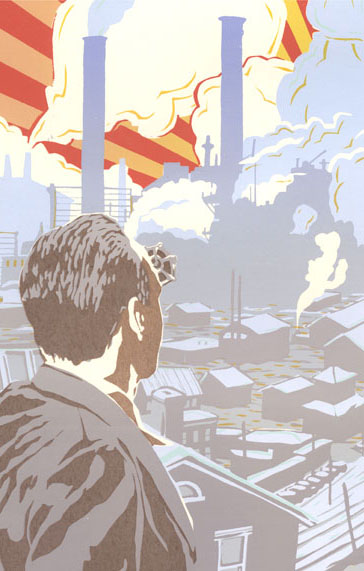
first print tentative cumbersome title, if it needs one:
'looking out onto the world, looking in at other people — and learning from the vernacular' ... something like that.
* * * * * * * * * * * * * * * *
updates from earlier than May 4th
back to the top of the page
|