secret door! older updates...
writings from earlier
|
|
secret door! older updates... writings from earlier |
|
|
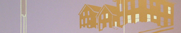
back to more recent writings * * * * * * * * * * * * * * * * May 4th first color As of May 1st/morning of May 2nd, the first color is printed. I'm doing a lot of color testing (thus the extended color mixing process), but I'm not making full proofs of every color or every screen before printing. So I'm making decisions as I go along, and definitely at some point early Wednesday morning there was one of those moments of: "oh no! these colors are terrible! and I've already printed 80 posters! what will I do!?" Luckily Scott was there to tell me that I just had to keep printing, and it's true that the next afternoon, pulling the prints out of the drying rack with trepidation, I had waiting for me a series of thoughts along the lines of, "hmm... actually, they look pretty all right... and in this place where I thought it was too dark, I'm going to print a light transparent color over there anyways... and I like the amount of contrast here, after all...." So in conclusion, the first color is done, it looks pretty good, the prints exist in physical multiples now. I'm taking the next two days to finish the wedding invitations I've been working on for my friends, and then more and more colors will be added. If you were waiting to subscribe until you heard that something had actually been printed, now is your chance... if you are going to wait until the first print is entirely done, then, well, you have to wait a little bit longer. To all the subscribers and traders, and recipients of gift prints, continued apologies for the lateness. One of my friends visited the studio today and said, seeing the rubylith stencils in progress, "This is the kind of print that you make two or three of a year, maybe — it's crazy to try and make six of these!" Which was, for some reason, very encouraging to me. first print tentative cumbersome title, if it needs one: 'looking out onto the world, looking in at other people — and learning from the vernacular' ... something like that. * * * * * * * * * * * * * * * * April 28th color mixing Yesterday, it was true, I did indeed shoot the first screen for the print. I used a spare corner of the screen to shoot an 8.5 x 11" pattern of scrap rubylith — which is something I have been wanting to do for a while. It'll be the first color for a collaborative postcard I'm making with A.Oesch, for our show, and it will probably be the messiest thing I've worked on up to this point (definitely influenced by Oesch's "messy style"!). It's nice that it's happening at the same time as this first print in the series, which is probably one of the most precise things I've ever done. I'm working on the whole "straight lines" thing, by the way — after the Magic City show, I'll be starting a minor side project, with the guidelines: make something every week, involving some kind of continuity/narrative, and including NO straight lines. This will probably show up on this web site as some point — it's partly inspired by a conversation with B. Shur about how the internet and printing (posters, books, comics, whatever) are both publishing mediums, as opposed to painting or sculpture, which are media for creation of art works. We expect (or assume) a work of art to be finished, complete. Whereas with a book or a print, or any kind of serialized art, there's an initial drawing or manuscript, some kind of hand made thing, that is continually in progress, then the publishing process steps in and releases one stage of it to the world, bringing it, in some sense, fully into being. Publishing is low-pressure (you can always modify and rewrite, put out a revised edition), but it's crucial: the act of simply getting something out there is recognized as a part of its creation. Even if our work is incomplete or imperfect, publishing will give it at least one finished form, and allow it to leave our heads and appear for people to see. This idea is more complicated than that, but since I can come back and revise it later, I'm just going to put this up for now. If you want to talk about it further, get in touch with me — now I'm going back to mixing colors, so the image I have in my head can appear on a piece of paper (multiple pieces of paper) for you to see. * * * * * * * * * * * * * * * * April 26th almost So, every day for the past week and a half, I've been telling myself that, the next day, I will be ready to print the first color (which is a gradient from dark blue-purple to light blue). And so far, it hasn't been true — but today, it's actually true. I've been trying to use a new method of working: usually, I get the transparencies ready for all the colors (taped down on top of a drawing, which I am also usually modifying as I go along) then take them all off and print. With this project, because of its predicted complexity, and to push myself to be a little bit less meticulous with it, I decided to try and get the first color ready first, then print it, then get the second color ready, etc. However, this didn't work as planned: the first bunch of colors ended up being more interdependent than I had expected, and instead, I now have the first color waiting for a couple more lines, and the next four colors (dark brown gradient, white, beige-yellow gradient, and light brown gradient) need about a day's more work. The next four colors will take a little bit longer. They are: two "shading" colors (a transparent light and dark), and two "key" colors (outlines that will go around things and sharpen up drawings). Here's an example of classic style screenprinting with a key color providing definition and detail (in this case by comics artist Hope Larson, though this might be more familiar as "rock'n'roll poster" style: the work of Pete Cardoso, Frank Kozik, Ed "Big Daddy" Roth, etc.) I haven't used keys a lot in the past — not out of purposeful avoidance as much as that I have been more interested in color interactions and possibilities without outlines... But using key colors for parts of this print is my attempt to take the pressure off myself to define everything with flat colors. We'll see how it works out... The big spate of rainstorms and dark damp days about a week ago didn't help — when it's humid the paper that my drawing is on expands, and the Rubylith plastic that the transparencies are made of stays the same size, so suddenly after a big rainstorm, everything will be misaligned. Now that it's hot and sunny again, it's all back in alignment. I'm not going to go into how small the size change has to be for me to consider it "misaligned", because it would just give Mike T. and Jacob more ammunition to make fun of me with. But I will say that when I print it, it will all get completely out of whack, just through the nature of the screenprinting process — which will be a welcome antidote to my present detail-oriented mindset. (oh yeah...the MT poster linked above is yet another example of a "key" style print...) other project news: — New Your City will be moving from the Fox Point Library to the Providence Public Safety Building (aka the police and fire station!). Natalie Purkey and Joanna Roberts are taking over from me to coordinate the move and the ensuing party; if you're interested in helping take down and rebuild the city (hot glue! mat knives!), contact Joanna at: joanna_roberts (at) brown.edu. calendar markings: — Friday, May 18th is the end-of-year-celebration and "Art Party" at New Urban Arts. 5-8 pm I think, 743 Westminster St. Providence. Featuring spoken word & poetry performances, fashion show, photography, drawing, silkscreen, painting, comics, etc, all by high school students — completely amazing outburst of creativity. Additionally the giant collaborative screenprint I've been putting together with students there will be released that day — in celebration of NUA's tenth anniversary, the poster combines almost fifty separate small works of art, by students, mentors, staff, and friends, into a screenprinted "quilt". It's gonna be awesome. — Sunday, May 27th is the opening of Andrew Oesch's and my show "Magic City Repairs" at the Stairwell Gallery. (6-9 pm, on Broadway between the new Nick's and the Korner Store, also Providence.) Don't worry, I haven't been working on the new work for the show yet at all, so it hasn't been interfering with the completion of the first print! But I'm gonna show a bunch of large drawings, and Oesch is gonna build a city. With very elaborate trees. At least, so I have heard. * * * * * * * * * * * * * * * * April 1st everything is happening, at once Subscribers and traders: the first print is still in progress. Major apologies for the now extreme lateness! It does exist, though, it is in the process of coming into existence, amid dirty pencil marks, eraser dust, and little tiny scraps of rubylith stuck to everything. At this point I'm not creating new complexity, but just attempting to deal with the implications of the complexity that I've already put into place. 9 colors — 18.5x30 inches (though not 25 feet deep) — a couple of rainbow rolls (aka color gradients) and transparent colors: it's pretty nuts. So, back to work... ... but first, two crucial notes: 1) — The New Your City project is almost over — we are having a party on this Tuesday April 3rd, from 5 to 8 pm, at the Fox Point Library in Providence, to celebrate its completion! The What Cheer?! Street Band will play, inside the library itself: it'll be extremely loud. If you can't make it to the party, the city (a sculptural cardboard construction built collaboratively by: more than 190 children; thirty young people, adults, and teachers; hot-glue-gun-master Ann Schattle; and myself) will be up in the library till the end of April. All kinds of information, directions, dates, times, etc. are on the web site. 2) — The folks at the Participatory Culture Foundation have thrown their laptop cases on to the subscription-project freight train and hauled themselves up bodily after them, settling down comfortably onto some sacks of grain in the corner of the boxcar and getting ready for the ride. PCF is a non-profit group that is building software to promote and facilitate (you) publishing and sharing (your) videos over the internet — without advertisements, and not owned or controlled by any media giants. Additionally, they create other rad projects like Make Internet TV and Open Congress. Mostly they are funded by foundations, however, like a lot of non-profits, they are looking to diversify their money sources — which is where your subscription to their free & open-source video player, Democracy/Miro, comes in. You get a t-shirt and some other special stuff, and it's way cheap, but the real point is that you'll be supporting the propagation of free culture and democratic media. Full disclosure: they are my friends, and they host this web site on their servers! But I'm plugging their subscription drive 1) because what they are doing is massive and visionary, 2) they do it with extremely low overhead (most of their budget is for software developers' salaries) so your money will be well spent, and 3) because I think subscriptions are an awesome and (mostly) unexplored way to fund independent projects. so, if you have five or ten extra dollars... subscribe to Democracy! * * * * * * * * * * * * * * * * March 13th/14th So... I'm still working on the first print in the series. Stuck all day on relatively unimportant questions of perspective construction, or rather deconstruction — creating a plan drawing from an existing perspective drawing. This should be simple, but I can't wrap my brain around it: I'm missing (at least) one variable too many, and nothing is made better by my housemate's Spanish language TV that keeps going in the background... Graphically constructed perspective is one of my favorite super-nerdy things to do... or has been, but I'm kind of hoping to beat it out of myself, and be totally sick of it by the time the print series is over. I'm getting close, tonight. As with (almost) everything I like to do, it's (almost) completely obsolete (in this case, replaced by vector-based CAD drawing programs and mathematically calculated perspectives). One person who's still doing it brilliantly, and keeping his oar in by collaborating with computer-based designers, is Steve Oles, whose website doesn't do his work justice (its value is better demonstrated by this page about how his drawings played a key role in the design of IM Pei's National Gallery of Art). He wrote basically the definitive book on constructed architectural illustration, which I'm now wishing that I owned. One thing I learned tonight from internet searches looking for information about perspective techniques: one of the computer programs available for making perspective images from your CAD files is called Piranesi, after everybody's favorite master engraver and prison-imaginer Giovanni Battista Piranesi — however, Piranesi the human is pretty notorious for having constantly and blatantly ignored all the rules of perspective to create intense dramatic effects. Obviously, writing this is a serious procrastination tactic, so I'm going to get back to it, guided by Francis D.K. Ching, the other definitive (not-so-obsolete) architectural illustration and presentation guru. Thanks, old draftsmen-folk — I look at your drawings, your hand-lettered books, your thoughts about what number colored pencil or what kind of eraser shield to use, and the late night at the drafting table is a little bit more companionable. * * * * * * * * * * * * * * * * March 6th Super last minute news! — I am going to show some new drawings as part of a group show at the Hera Gallery in Wakefield. The show is called "Concrete: works from the urban environment", curated with extreme patience by Chelsea Heffner of Hera, and it's going to be an interesting spectrum of Rhode Island artists. The project I'm showing (title: Triple Decker) is an in-progress group of drawings of the building I live in, a typical-yet-spectacular southern-New-England apartment building that supports almost all the functions of my life. These drawings made Scott say, "Wow, you really are an architect!" which is not true (see partial requirements for becoming an architect), but I do indeed know how to make traditional, hand-drafted, measured plan and section drawings of buildings, if that counts for anything. And they have a lot of straight lines, MT. The show opens March 10th, this Saturday, with an opening party from 6-8 pm, and runs through April 14th. Hera Gallery is at 327 Main St. in Wakefield, RI. See you at the opening! * * * * * * * * * * * * * * * * February 22nd It's been a little while -- the real life priorities have taken over the internet updates. — I'm working on the first print in the print series, but, as usual in this world, it's going to arrive late. I'll mail them out/deliver them sometime in the second week of March. I apologize, and/or (as I've been doing since tenth grade or so...) extend promises of an 'even more awesome' final object, if you can just hang on for a couple of weeks. Thanks to the subscribers and traders for subscribing and trading, and for patience! If you want to subscribe, there are still a bunch of spaces open, and lots of time. other things that are happening: (contributing to the lateness of the first print!) — New Your City is about to start! It's a participatory city-building project, in which Ann Schattle and I facilitate the construction of a giant cardboard-and-recycled-junk city at the Fox Point Branch Library in Providence. Many of the city-builders are elementary-age children and their parents. Whatever your age is, YOU can and should stop by any Wednesday, Thursday, or Friday afternoon in March and build something for the city, or help someone else realize their vision. Look at the New Your City website for more information, or email me with questions. — Persuaded by prevailing logic and Andrew Packer, and assisted by helpful web sites (HTMLSource among others) and software (Firebug and Textwrangler), I have learned more html and some basic CSS skills and used them to make the New Your City site. Though I'm now kind of embarrassed at the clunkiness of this site's design, I'm going to wait to redesign it till the first 'everyday spaces' print is done, so look at this for a better representation of my (still learning!) html/css ability. — I am beginning to work on a collaborative poster at New Urban Arts, an after-school arts program for high schoolers. We are collecting small square images which we will make into a mosaic- or quilt-like screenprint in celebration of NUA's 10th Anniversary. If you are a current or former NUA participant, download a pdf of instructions for sending in your image. — Andrew Oesch and I are planning ahead to May/June when we will be creating an art exhibit called "Magic City Repairs" at the Stairwell Gallery on Broadway, in Providence. An offshoot of this project will be installed in the Dirt Palace front window around the same time. Our first thought problem, posed by local philosopher Dave Sharp: "Why is the magic city broken?" — I found one of the Robin Evans books in the library (RISD decided to let me check stuff out again!). It's super exciting reading, he's one of the only people I've ever come across (figuratively — he died in 1993) who has looked at ordinary buildings and spaces with regard to their uses and occupation, and the social and political implications of that occupation. His essays "Figures, Doors, and Passages" and "Towards Anarchitecture" are really interesting and inspiring to me. I'm about to buy the one book of his that's still in print: The Projective Cast. If anybody has an old copy of Translations From Drawing to Building, I would be happy to buy it off of you or trade you something for it — I need a copy that I can mark up and draw in. — In addition to all this, we've been taking care of a sick baby kitten who is now healthy and has become the bitin-est and scratchin-est (though still cute). She's soon to go a new home, and then we'll start figuring out what to do with the pregnant teen-momma cat who's been living in our stairwell for a month now.... This is in addition to the two grown cats that already live with us. (random public service announcement from the amherst st. cat haven: please get your cats spayed & neutered!) Okay, that's it! Back to work on the "windows" print. Thanks to Scøtt, Jonathan, Jason, and AG(T)P for mix cds. * * * * * * * * * * * * * * * * January 8th. Welcome! to the people who are now subscribers to the print series! Thank you also to the people who have talked to me about these ideas, given me advice, helped me edit text or decide on ink colors, cooked me food, driven me places, or simply expressed your support for the project. I like to number prints, not because I want to keep them scarce, but probably out of some deeper need for order & organization in the world. If you are the 24th person to subscribe (ie. to give or mail me a check, to arrange a meeting place, to confirm a future or immediate trade, to pay a first installment, etc) you will get the "number 24" of each of the prints. This may not matter to most of you, but some people were asking. Web site will be under construction for a while. I have a lot of stuff to do in the non-virtual world, so the virtual world is getting left more or less by the wayside. Sorry, internet friends. However -- I did figure out how to use tables in html, so this is somewhat easier on the eyes. Also, there is now a reading list, including some books I am having trouble getting hold of -- do you know anybody who dropped out of architecture school and no longer wants their old theory texts?
* * * * * * * * * * * * * * * * back to the top of the page |